

EnglishGeneral
Bible Graphic Design
 Andy Warren-Rothlin · Feb 20, 2023, 11:46 AM · Last modified: Sep 28, 2026, 11:39 AM
♡ 0
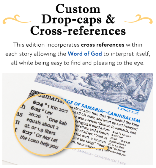
Typesetters and graphic designers among us should see: The Word of God (The NASB HIStory Bible)".
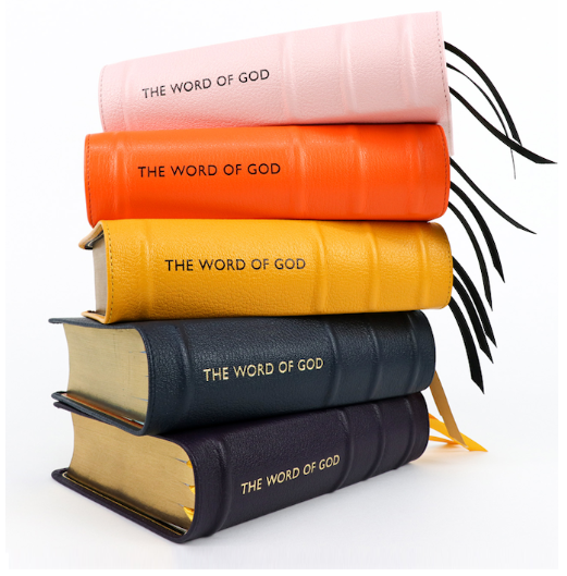
In America, you can now get a compact, bright orange, Gustave Doré-illustrated, dropped-initialled, sans serif-titled, blue-letter edition of a formal-equivalence English translation that "focusses on the stories not the chapter and verse numbers". Er ... wow!
This ... er ... modest product is produced by an organisation called "Humble Lamb" and is called The Word of God. It's available online here.
Who could possibly be the intended audience? Are there people in the US who want this combination of features?
(The unusual choice of text in the above image is the publishers', not mine!)
Attachments
- Unbenannt.png320 KB
- Unbenannt2.png425 KB
5 comments
Sign in to join the conversation.
Apparently there are at least 538 people who want one. On kickstarter, it doesn't take too many. I grew up reading the NASB (mine was a hardcover with color illustrations), so it's not extraordinary to me that at least a handful of people might want a beautifully designed Bible in that version.
Not planning to buy one, but attractive art work, providing headings which demarcate episodes and cross references all seem good in that they will draw some people in and end help them get to grips with the text. I wouldn't choose NASB or Dore but hey - I'd rather people spend their money on a fancy Bible than many other things
A colleague asked me offline for more on what I was getting at here.
What really struck me was not so much the graphic features themselves (I realise there’s beauty in each of them individually), but the combination. For example:
The intended US audience clearly doesn't have such fixed design categories as people might have had in the past. And I'm wondering to what extent that reflects increasing cultural diversity in US churches and/or a more eclectic spirituality (which I believe is typical of many 'progressive' Christians).
As many colleagues know, the adoption of cultural elements, imagery and graphics in very different cultures can often happen at variance with the norms of their source cultures. Just as African traditional carvings and decorated calabashes get used by Europeans as bookends and doorstoppers, and European curtain-hooks and tea-cosies get used in West Africa as earrings and woolly hats, so crucifixes and decorative page-borders in western publications may be popular with some West African evangelicals, unaware or not bothered by the fact they were intended for Catholics and Muslims respectively. So I'm wondering, in Bible design in both print and digital, are fixed western categories breaking up, being mixed, being watered down or simply becoming irrelevant?
A further innovative idea: the Bible on black paper.
The Bible on black paper actually intrigues me. One of our translators is very visually sensitive, due to a history of untreated eye injuries. He has Paratext set up in "dark mode", where the background is black and the letters are white, which he looks at while wearing sunglasses. This reduced the brightness, which he finds tiring.
Others on this forum have talked about similar design elements which help the neuro-diverse, such as using green ink on a soft cream-colored paper, to reduce the contrast. Is there perhaps an audience for a black paper Bible due to vision issues?